1UP Gaming
For this project I needed to design an app and responsive website where users can research, follow trends, and purchase gaming computer components. The goal of the app is to give users easy access to research, news, and purchasing on a single platform. During this project it was vital that I conducted multiple usability studies due to the highly interactive nature of the product goals
Project Details:
Client: Computer Component Ecommerce
Duration: 2.5 Months
My Role: Lead UX Designer/UX Researcher
Responsibilities: Conducting user research, wireframing, prototyping, visual design, conduct usability studies, and journey mapping
“A place where gamers can research, follow trends, and purchase gaming computer components. "
Research
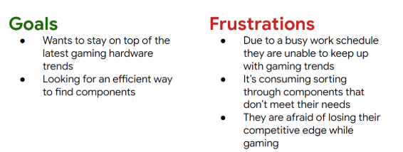
I began with getting an idea on the process members of the gaming community go through when purchasing components for their machines. I used primary sources and found participants through reddit, discord, and friends. I used surveys and interviews to gather information and create a persona.
Through this process I uncovered a few problems gamers faced when shopping for computer components:
Participants expressed frustration with having to visit multiple sites for making a purchase and researching components.
Users find it time-consuming to keep up with the latest components
Participants expressed it can be difficult to gain in-depth insights on product performance.
“I love playing on my PC, but keeping up with the latest parts can be a hassle.”
User Flow and Mockups
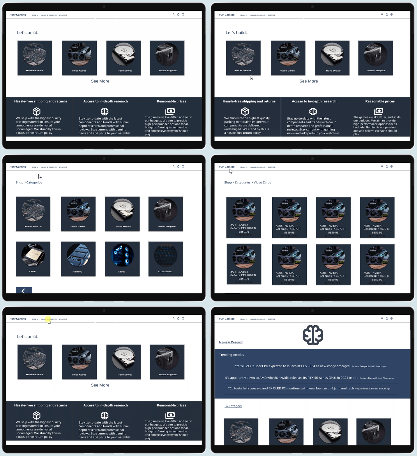
User Flow. A major goal was to have the design be a one-stop shop that took users from discovering a new component, to research, and then finally making a purchase. Using information gathered during my initial research I developed a user flow.
Wireframes. Having an established user flow helped with wireframing by providing a framework of the elements that were required on each screen to allow the user to reach their end goal.
Mockups. When moving from paper wireframes to digital, I focused more on shapes and the placement of elements.
Prototypes
Low-Fidelity. The main goal of the lofi prototype was to test the user flow in an interactive settings. I wanted to guide users along their journey while allowing them the freedom to deviate from the flow to suit their needs. Important considerations during this stage included:
Does the order of the screens make sense?
Are there too many or too few steps?
Does the user have the ability to deviate from the planned flow?
Early Design. With the first iteration of the designs complete a usability study was conducted. During the study the users were tasked with finding a product from an article, locating research on the product, adding it to their watchlist, and then completing a purchase. The study produced three major findings:
Users found pages be to cluttered, leading to some confusion
Navigation bars are not laid-out in an intuitive manner
Lack of aesthetic appeal. Quote from a participant: “It works, but feels janky.”
Refined Design. Significant changes were made to the early designs that addressed the problem areas uncovered during the usability study. Elements that were used to direct users to different sections (research, news) were moved to product category pages for mobile users. Navigation bars were updated to a more common and intuitive design. Color selection on both mobile and web was changed to have more contrast, giving the design a “lighter” and “cleaner” feel.
Takeaways
This project showed me the importance of conducting user research and usability studies throughout the entire design process. Many of the elements in my designs were discovered after the initial usability study.
Making use of open-source assets and incorporating negative space. A simple but important lesson I learned was to not hesitate to use open-source assets, “Don’t reinvent the wheel.” I also learned the importance of incorporating negative space.
Areas of improvement
Overall, users found the flow from Researching to completing a purchase to be intuitive and they enjoyed the watchlist feature, but there are a few areas I identified where I can improve:
Establishing a design system. In hindsight, I should have prioritized my design system early on. I would have spent much less time when moving from low-fidelity to high-fidelity, while dramatically improving the aesthetic appeal.
Research methods. I want to incorporate more live meetings or video chats in my research. Being able to see the body language of participants would allow me to get a better idea of how a user actually feels about using the product and when follow-up questions would be helpful.


