Art Museum mobile app
For this project I was tasked with designing a mobile app where users can find museum information that includes exhibits, events, and ticketing. The goal of the app is to make it easier for people to plan visits. A consideration that made this project challenging was the amount of information that needed to be contained in a condensed format. As a result, it was vital that I conducted in-depth user research to ensure my design was meeting their core needs
Project Details:
Client: A community art museum
Duration: 2 Months
My Role: Lead UX Designer/UX Researcher
Responsibilities: Conducting user research, wireframing, prototyping, visual design, conduct usability studies, and journey mapping
“If a patron can access museum and event information while on the go, they can spend more time enjoying the museum instead of planning.”
Research Methods
I used primary resources for research that consisted of interviews and surveys. Participants raged from ages 25 to 65 years and were working.
Through the results I uncovered various pain points that include:
Unable to access exhibit closure information
Inability to keep track of events
User Persona
Wireframes
Paper wireframes
A challenge I faced was the amount of information that was needed to be included. While wireframing my initial ideas I focused on making sure the vital elements were included rather than placement. I like the low-commitment nature of paper wireframes when I’m getting ideas down
Digital Wireframes
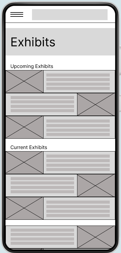
From the quick sketches I then picked the features to include in the digital wireframes. At this stage I shifted to focus on placement and visual considerations.
Prototypes
Once comfortable with the initial designs, I used the low-fidelity prototype to conduct a usability study that uncovered some problem areas that included:
Users expressed a desire for exhibit closure information on the home screen
Lack of back buttons caused frustration
User found finding tour information to be unnecessarily challenging
Low-Fidelity
Using the results from the usability studies I was able to implement meaningful changes to my design for the high-fidelity prototype. During this stage I made use of color to assist with the information hierarchy.
High-Fidelity
A design system was created to ensure brand consistency. The goal was to invoke a classical feeling through the use of bold colors and serif fonts.
Branding
Takeaways
During this project I learned a lot about incorporating different design elements such as tiles to help with grouping. This project reinforced the importance of a design system due to the many repeating shapes and styles.
A lot of information needed to be included on a single page, so it was important for users to easily distinguish what pieces of information went together.
Areas of improvement
From observations during post-completion testing, the design worked well and users like the quick access to exhibit information, but there were some areas where I feel I can improve
Accessibility. I would like to better address accessibility concerns through the use of voice to text. There was a lot of information which can be challenging for the visually impaired.
Animation. An image carousel would have been a great feature, especially on the exhibits page.


